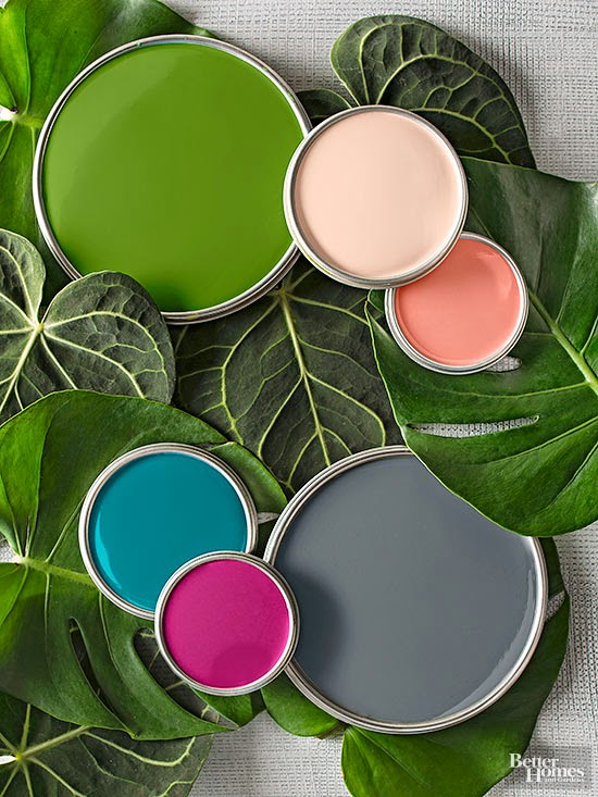
No Paintbrush Required BUT you can use one if you like! You can mix pieces through textiles or paint. The new look and colors for this year are Rain Forest Green, Warm Blush, Shape-Shifting Coral, Sophisticated Gray, Fresh Berry and Oceanic Blue.
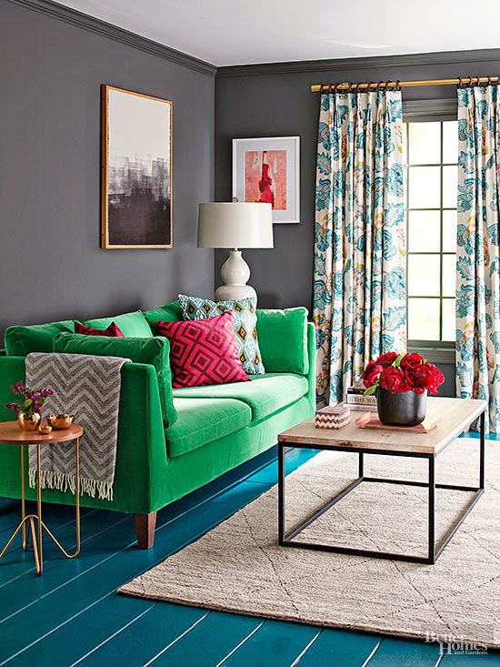

Dial up the rich gray, dial down the coral, and the mood is serene, sexy, and sophisticated. And don’t stop with the walls. Painting the floor gives a room a whole new look. Deep teal works here because it’s the same intensity as the gray. No fears of dark forces taking over, though: A pale gray ceiling, neutral rug, and other light, bright touches deliver visual breathing room. Art, pillows, and flowers add the kick of berry bright.
Get Gray Right: With a saturated color, test first! Paint a piece of foam-core board, and move it around the room to see how it looks at different times of day. It’s the sure way to get a gray that doesn’t go green.
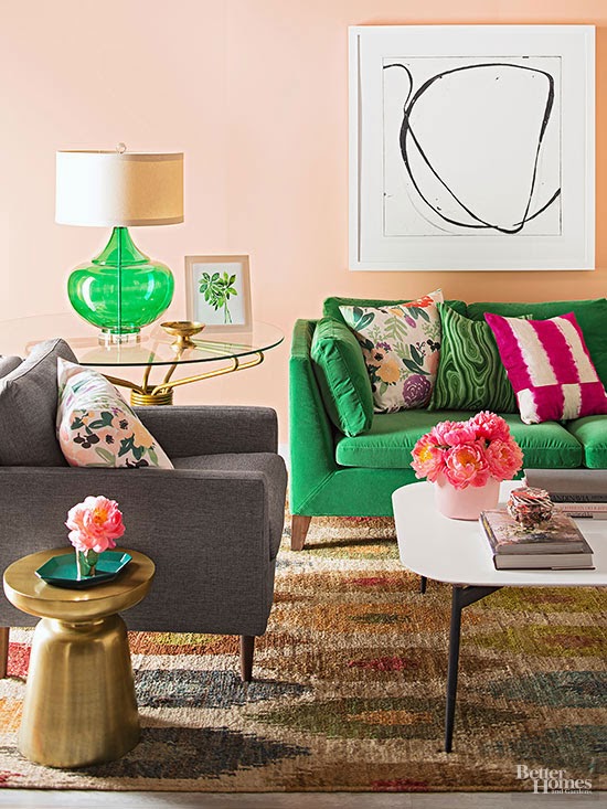
The Showstopper: A jewel-green Stockholm sofa from IKEA packs a lot of mmm-velvet, retro-fresh, midcentury style for a modest $999. Trust us, you won’t get sick of it. Green is nature’s neutral, and bringing it inside feels as good as soft grass between your toes.
Splash soft coral on the walls, and the vibe goes happy in a hurry, especially when the palette also includes plenty of gorgeous green, from deep and mossy to luminous and bright.
Change your pillows and change the look of your space. Take the pillows out of this room, for example, and it goes surprisingly neutral.
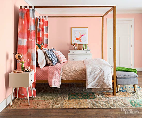
Flattering blush hues guarantee you’ll look good. You’ll be current, too, when you pair soft, romantic shades with bold corals and grays. We brought ours in with graphic, sponge-painted curtain panels, a fresh way to soften a clean-lined canopy bed.
Underfoot, we revisit the Turkish rug. Our palette comes together in antique blocks that were washed, redyed, and stitched into a unique creation.
